Friday, August 12, 2011

Self-Portrait


My first inspiration I chose Self Portrait on a Paper Bag by Joe Monica consists of line and shapes that create the features of the face. The technique that the artist used was very interesting. If you magnified one area you would lose the features of the face and only have a design.

My second inspiration piece is Camera picta (Camera degli sposi), Pilaster; Self Portrait by Andrea Mantegna. I like how the artist becomes one with the artwork. He is one with nature because he is part of a plant stem.

My third inspiration piece is Self-Portrait by Andy Warhol. I chose this one because of the vibrant colors that creates the piece to have energy. Also, I like the screenprint process Warhol uses.
I used computer software to create the effects and printed it on canvas. Then I added acrylic paint to the canvas. These are two mediums I like to create with. I used the acrylic to emphasize the features that I like, which is my hair, eyelashes, and lips. 

The challenges I had with this project were how I was going to represent myself. I thought of painting myself, photograph, and working with my reflection. I just had my 20 year reunion last weekend and I decided to play with the image that was taken on that day and my senior portrait. I worked this idea over and over. I chose to split my face in half because the other half will be created as I go on with life also I believe I’m more confident that back in school so I made the face close-up. I put my senior portrait to represent my eye because that person is still part of my soul.
I used line in the eyelashes and to accent the hair. Color is used in my hair and my lips. The image in my eye seems to pull your attention in first and then your eyes look at the whole.
I did not like this project because I had a hard time representing myself. It’s not my favorite but I’m satisfied with it. I had so many options started and really didn’t like any of them. So this is my final image.

Wednesday, August 10, 2011

Reflections of AED 200


Vega-Nor, Victor Vasarely, acrylic on canvas, 1969
My expectation of this course was to learn to analyze art. I believe I have learned a lot but still it is difficult not to discuss your preferences while analyzing. Also, I was hoping this class was going to ease me back into school mode and I believe it has but still intimidated to go back in a few weeks. Writing papers is what scares me the most. My last three years at UB were all studio classes so it has been a long time. Art is a creative process that uses the elements and principles of design. My favorite artist is still Victor Vasarely. His use of color, shape, and lines is amazing to create the optical illusion on canvas. The online course was a lot of work but I would definitely do it again. I proved to myself I could stay focused and not fall behind.

Reflection on Art Criticism Article


I chose Debbie Russell’s exhibit How Bizarre…How Bizarre out of four exhibits I looked at. Surrealism is a favorite of mine because I like the thought of the unconscious creating these works. The mind is a very intriguing in the psychological aspect of it. My biggest obstacle of this article was just getting started. I knew once I started I would finish in a reasonable time. Critiquing my peers doesn’t bother me. If you are an art student you get accustom to the process and you take the input to make the project better or take that information to the next project. You cannot look at it as a negative comment. I would like to see what my peers said about my exhibit. I would rate my article an 8. I think I gave the reader a good insight into the exhibit but I’m no Clement Greenberg either. I did not like this project at all. I don’t know if it’s because it is the last week or because I hate writing papers. Once I wrote it I did feel better about it and glad it is done.

Monday, August 8, 2011

Art Criticism Videos


Lavender Mist, Jackson Pollock, oil on canvas, oil, enamel and aluminum on canvas, 1950
I chose Greenberg on Pollock: An Interview by T.J. Clark. Pollock created his first drip painting in the summer of 1947. When he received the Guggenheim Award, he said he was making art that lies between the easel and murals. Greenberg believed Pollock expressed himself very well and never listen to the critics. What Pollock meant by easel art is the typical contained artwork; it stops at the edges of the canvas. Pollock would find his edges once he stretched the canvas. Greenberg said Pollock’s work wasn’t Dionysian work because there are all kinds of order and the only demand on art is good art. Greenberg said it is Apollonian art because it had an open, lyrical and achieved feeling. Pollock would reject some paintings because they were not pleasing to the eye. Sometimes he would fix them and others he left. Artists felt isolated in art and the world as a whole. They didn’t get the celebrity status as they wished for but Pollock wasn’t going to sell himself out either. He produced about one painting a year. In his last year of life he came to some conclusions, he wasn’t going to become an art school painter, he didn’t look at Impressionists enough, and he always wanted a romantic death, which he got.
The next video I watched was Greenberg on Art Criticism: An Interview by T.J. Clark. Greenberg was quoted as saying “writing about visual art is much tougher than writing about literature or music.” He would reread Tovay so he could refocus and be relevant to the piece and not add his opinion. He said his preferences do come out but he tries to hold them in. He accepts art when it is good. He believes that you don’t need art history just receptive to be a critical. After WWII, there was an art boom and abstract paintings were not private anymore but the public had the respect to enjoy the art even if they didn’t understand it. Greenberg believes art cannot be good unless the artist has a lot of world experience. In modern art, certain artists proved themselves but not the classification as a whole. He believes value of judgment comes first.

Pavilion of Algeria
The last video was The Colonial Encounter: Views of Non-Western Art and Culture. The Paris 1900 World Fair lasted 8 months and had 15 million visitors. The colonial exhibit showed nationalism but colonies of France did not get the same treatment. For each country represented they used famous monuments of that country. Dahome did not look like that; their structures were made out of thatch, straw, and mud. They showed them as barbarians with pictures of violence against each other so who said they wouldn’t treat outsiders that way. Now the Algerian exhibit consisted of two palaces. France colonized Algeria longer than Dahome. At their exhibit, you could dine and taste wines. They had a street market were you could buy artifacts or souvenirs. Arab women were depicted as promiscuous because of their belly dancing. Now African men and women were displayed in cages with animals with no clothes on. Europeans justified it because they believed it was being used as a scientific and artistic study. If you look at the women’s faces they didn’t want to be shown like that. Trocadero Museum was the heart of the colonial exhibit and emphasized racial differences. Today, former French colonies are independent but are still linked to the West by politics and economy. Exhibits within the museum had no cultural information on them so viewers look at it as art not cultural objects. The up side of it is as being displayed as art in Western collections, descendants can appreciate the original object.
All three videos relate to the art criticism project. Clement Greenberg was a famous critic in his day. I enjoyed knowing he still had difficulty separating his preferences from critiquing a work of art. Also, that he told Pollock not to listen to the critics but he was one. The Colonial Encounter video shows us how curators of exhibits can influence the public by the way they display it. The films were interesting. They do help a little more to understand how to critique our peers. I’ve been critiqued many times on my work but this seems different and more difficult.

Sunday, August 7, 2011

Snapshot Reflections Journal


To create this project, I first decided on a theme, which is Photorealism. I researched on the internet for artists and made a list of them that peaked my interest. I downloaded about 50 works and had to decide how am I going to weed my selection down more. I went into Photoshop and made contact sheets of the images. I looked them over and decided on the theme of reflection in Photorealism. I cut each image out and placed them in the order I wanted them seen. Then I got all the information I needed on the artwork and began my Powerpoint file. I put the artwork information and image into each slide. Next, I started my interpretation of each one and while working on that picked my fonts and colors. After that was done how could I step it up a little, so I added animation and sound clips. Hope you enjoy my exhibit.


Monday, August 1, 2011

Lowbrow Art, Tate Modern, Native American Bones, and George Eastman House Video Review

Rose, Mark Ryden, oil on panel, 2003
 The video The Lowdown on Lowbrow: West Coast Pop Art discussed lowbrow art. Lowbrow art was used to categorize all the rest of the art. It was a reaction to highbrow art. It consisted of naked girls, hot rods, popular culture, pin-up, space age, and rock-n-roll. Some of the first of the artists of lowbrow are Ed Roth, Robert Williams, and Von Dutch because it began with the car culture. Lowbrow artists didn’t have galleries that would show their art so it became a social scene. They would plan parties and show their work at the parties. The work was narrative there was something going on, ready to go on, or happening in the present. There was no artist statements or training. It was more open to women artists than any other movement. Since it began on the Pacific Coast it owed nothing to Europe and its art. To create lowbrow art you didn’t need permission; if you wanted to do it then you do it. People got more acquainted with the art through the covers of records and CDs. It is not considered lowbrow anymore, it is called Pop Surrealism and there is more than 1,000 artists.

In the video In the video Displaying Modern Art: The Tate Approach shows how the Tate modern displays their art and might be the reason why the have had over 4 million visitors. The museum influences the way we look at art. Tate does not show its art in chronological order as the MOMA does instead they break the art up into 4 sections. The one section is landscape, matter, environment, next is nude, action, body, then still life, object, real life, and last one is history, memory, society. The rooms within the sections are self-contained. The presentation of the art allows viewers to have no knowledge of art and it should be used as entertainment. Themes are suppose to be challenged with some of the work that is placed in them. Also, they are set up this way so the viewers will not get bored it is like channel surfing on the TV.

The video Bones of Contention: Native American Archaeology is about the debate of archeologists digging up the Native Americans burial grounds. The government eventually passed a law in 1990 to return the bones to the tribes. In 1985, the Smithsonian had 18,000 Native American bones. It is a slow process but now they have to measure the skulls and determine which tribe the bones go to. Lakota Sioux reject the theories of evolution and migration and they believe they were created. Great Plains Omaha Indians want their bones to be analyzed for cultural and medical reasons before returning the bones to the tribe. Native Americans spread their history orally. In the early 20th century, Native American children were sent to boarding schools so they would lose their identities. Dr. Reinhardt has to restore pride with sharing his research with today’s Native Americans. Archeologists are not solely responsible for telling the past they need to share the job with many people.

The last video I watched was George Eastman House: Picture Perfect that discussed George Eastman and his home that is now a museum. George Eastman is the father of popular photography and inventor of motion picture film. In 1900, the Brownie camera made photography very accessible to everyone. Ansel Adams’ first camera was a second hand Brownie. In the museum there is a Cinematographe, which the Lumiere brothers created in 1894. It looked like a box but it took and played movies. Eastman and Edison created flexible, rolled 35mm film that changed movie industry. When they went to restore the house, Eastman had all lot of photos of it so they could replica it as close as possible. In 1996, the Eastman house created the first school in North America for restoring, preserving, and archiving motion pictures. The museum creates access to its collection by publication, exhibition, and online.

I believe the videos of Lowbrow Art, Tate Modern, and Eastman House do relate to the art exhibition. They all discussed the different ways that you could show art. Lowbrow art was shown at parties, Tate Modern uses themes, and the Eastman House has exhibit rooms but also exhibits the technology that was used to create the art. The Native American Archeology video had more to deal with a political issue. It reminded me of the debate over the Pantheon Sculptures.

I enjoyed the Lowbrow Art and the Eastman House videos. I enjoy that kind of art but didn’t know the name of it. I have been to the Eastman House several times. Tate Modern was a little dry after awhile. The Native American Archeology is another government issue that hopefully gets all the bones to the correct tribes. The Tate Modern video does help me keep in mind that you want the viewer to be excited and not lose interest. Also, the Lowbrow art video helps to imagine a space that doesn’t have to be white walls and sterile. It definitely could be a party space and you use the art to decorate.

Thursday, July 28, 2011

Abstract Expressionism & Pop Art


I chose Abstract Expressionism and Pop: Art of the ‘50s and ‘60s because the artists in abstract expressionism applied color to let the viewer feel emotion. Pop art is interesting because it deals with everyday things in the commercial market as an art form. 

Franz Kline C & O deals with the space between the viewer and the painting. The color and form gives the painting impact and ambiguity. Colors float in no define space letting your imagination take control. Kline began his abstract paintings in only black and white but later added color. The act of creating the work was as important as the final piece.

Splotches and drops of color and forms cover the canvas Mountains and Sea by Helen Frankenthaler. The forms have life of their own. This painting was the first that she laid on the ground to create it. The way she applied the paint with a rag let the color sink in like a stain and not sit on the surface of the canvas. This technique caused unique colors to appear and it gave the artist no control. Whatever happens happens. This work was the first step for her into the spiritual and traditions that molded her. 

Willem de Kooning Morning: The Springs consists of marks that would be left by ice skates. The abstract forms are ones we recognize as plant shapes, light, and falling water. As de Kooning works on the piece he reduces and eliminates where he sees fit.

Jasper Johns Flag is as if we are seeing the US flag for the first time. Johns uses what is found in real world as in letters, numbers, and targets. The image is seductive and pulls you in, is a real flag or an abstract one. The painting has many layers of newspaper and paint, which has blobs and drips and the viewer, sees the many layers but can see it as a whole. It is a bold, simple, and symbolic piece.

Andy Warhol The Texan: Portrait of Robert Rauschenberg was like a son paying homage to his father. There are 28 images of Rauschenberg arranged in four lines. The feeling you get from the image is of a wanted poster. Warhol implemented the ideas but his associates executed them. He created this in his studio he called the Art Factory. The studio created 1,000 images a year. There is no individuality; Warhol creates his work so you don’t know where artificial stops and reality begins.

Roy Lichtenstein Girl with Hair Ribbon surprises and seduces you. He creates a mechanical coloring style like comic books. When we get closer to the painting the details take on a life of their own and you loose sight of the whole. The details are either dots or the white forms that between the dots. Lichtenstein used comic strips for inspiration on love and war, which stirs emotion and passion. The images use traditional ways to depict feelings by the way he draws the eyes. 

 The other video I chose is Andy Warhol: Images of an Image. Screenprinting is very enjoyable for me and I enjoy how he pushes the ideas. Warhol interests me because of his mind. He seemed so odd but then you wonder why he does what he does. He created Ten Lizes in 1963. It consisted of ten faces of Elizabeth Taylor but they were all the same. This idea was like an assembly line there was no distinction from the first one to the last one. The work does force the viewer to move because the white paint reflects differently and each image has a little different look. Repeating the motif causes you to feel dizzy and the image to invade everything. Warhol became an icon himself with his art, movies, and magazine. He would use a Polaroid camera and would take portraits of his friends and reproduce them as a print. He was making the celebrity a commodity, which is what society does and he was making it high art.
The in-depth discussions of paintings help to understand the abstract expressionism and pop art better. The more we see and hear about it the more the brain contains the information. Again I did not like the format of the Abstract Expressionism and Pop: Art of the ‘50s and ‘60s. It cut your attention off every time it went to a different artist. The information was good though. Andy Warhol: Images of an Image was great. I liked to see the artist view of the paintings or prints. I never knew about the Art Factory before so that just adds to my thoughts about Warhol that he very flamboyant and a little off.

Pointillism, Dadaism, and Surrealism

I chose Dada and Surrealism because I enjoy Surrealist paintings. The artist using dreams and the unconscious to create paintings intrigues me. Dada artwork interests me but I have a hard time recognizing it. The video discussed six different artists that span these movements.

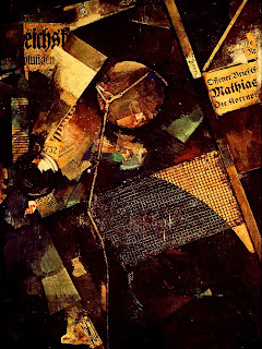
Kurt Schwitters was considered a Dadaist but he opposed them. Dada artwork explores what art can be and the thought of art embracing everything in the world. His work Merzbild 25A is a collage that uses cardboard, string, paint, and newspapers. The artwork consists of triangular and circular forms and also line and color. His work is an act of discovery as well as design. He began a magazine not to promote his work but modern art.

Hannah Hoch Cut with the Kitchen Knife is an attack on the society that she detests. The Dada work shows fifty different faces. Some are political leaders, physicist, and Dada artists. She finds the images in magazines, newspapers, and books to create her piece. It is chaotic and has blackness to it but also has energy.

George Grosz believed you shouldn’t live a city too long because you lose your identity. He pretended to be the saddest man in Europe. His work Untitled was a Dada painting that showed a bitter residue within the city but there is no life and you feel trapped. He also created Pillars of Society that depicts politicians, soldiers, leaders, and priests. He believes the people in this painting blindly lead society.


Joan Miro Dutch Interior I is a parody of a Dutch 17th century painting. The Dutch painting is exactly the way you would see it in the world. Miro uses patterns organized in its own terms. When you see the paintings side by side, the forms that Miro paints depicts the man with the guitar, dog, and cat. It is a Surrealistic painting because our subconscious mind can see these images even if they don’t look like you could.

Salvador Dali The Burning Giraffe shows a world that nothing makes sense. The figures have drawers as part of their forms; crutches seem to hold them up, which is a fetish of Dali’s. His paintings usually consist of an arid landscape that reminds him of where he grew up in Spain. His paintings were usually of civilization in a decay state. Dali was very influenced by the thoughts of Sigmund Freud, which he was a great influence for Surrealist artist. The drawers in the forms represent the ideas in our minds that are tucked deep inside.

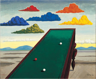
Man Ray La Fortune has components that are painted true to life. Each component diverges from reality. The billiard table is at a skewed view and the clouds are each a different color. There is one for each primary and secondary colors. He likes to play with the juxtaposition of unrelated objects. Man Ray began as a Dada artist and then turned his interests to Surrealist ideas. The painting is open to many interpretations but a few are luck and wealth.

 The next video I chose was A Sunday on La Grande Jatte, 1884 by Georges Seurat. He covered the canvas twice, which we know by x-rays. The painting is made up of dots and dashes and uses color to create an illusion of them mixing to create a cohesive image that is characteristic of pointillism. Seurat in his early years had great emphasis on drawing. He used texture paper and conte crayons to create these drawings of light and dark. A Sunday on La Grand Jatte has no clear interpretation, one thought was the island was well known for prostitution and the woman with the fishing pole may be one of them. The monkey on lead was added at the last minute but might help the interpretation because monkeys represented sexual desire. The prominent woman to the right might be a coquette, which would have several lovers, but always looking very fashionable. When he was preparing to make the painting he spent 6 months going to the island and sketching from the same vantage point. The proportions of the figures are off and the little girl in the middle of the composition is not covered in dots just white paint. The lady that stands next to her is in the identical pose of the Egyptian art of Lady Tuya. He also created Bathers at Asniers, which represented the lower class on the opposite shore of the people in A Sunday on La Grande Jatte. They are both 11 feet by 7 feet and believed they are suppose to be displayed together. France lost the painting in 1958 because they believed it was not worth it but changed their minds later. Frederick Clay Bartlett from Chicago bought the painting for $20,000. Since this painting is reproduced in so many ways people make a pilgrimage to the Chicago Art Museum to experience it the correct way.
The videos expand on the understanding of the movements of the 19th to mid-20th century. They show more detail on certain works of art and explains it more than what the book tells us. Dada and Surrealism video I didn’t enjoy because of they way it was broken up into six different films but was spliced together. I enjoyed A Sunday on La Grande Jatte, 1884. I learned so much more about the painting that I wouldn’t get out of our book. I never knew it was in Chicago and know I want to make the pilgrimage to see it.

Sunday, July 24, 2011

Paper Mache & Paint - Mask Making


I chose three masks from the Day of the Dead festival. It is held on November 1st and 2nd. This Mexican holiday coincide with the Aztec festival dedicated to the goddess called Mictecacihuatl. The festival is a celebration of remembering friends and families that are deceased. During the celebration, they build private altars, make the decease’s favorite food, and take it to the gravesite as a gift.
All the samples of masks are skulls. I have always enjoyed the Day of the Dead masks they are joyful and festive instead of scary and gruesome. The colors attract me the most. The third mask I chose was because of the flower and hairstyle.
The first mask I chose uses very vibrant colors. It has flowers that fill the eye cavities. Two birds reflected of each other on the forehead. His teeth with the lines around them show movement like they are chattering. The mask is covered with all this line work, which makes the mask have rhythm that creates such energy. It is symmetrically balanced what element is on left side is reflected on right. 

The next mask also has a flower filling its eye cavities. There is a pink flower in the middle of the forehead. The mask’s mouth is wide open as if it is ready to say something. The mask uses all the colors on the color wheel and they create this joyful skull. Line work is used again on this mask to create symmetry. It uses repetition of the same teardrop shape throughout changing its size and color. 

The last mask I chose has this red flower in her hair. Her hair and the flower are sculpted so there are 3 dimensions form to them. This mask only uses red, black, and white as a color palette. The mask has a heart, teardrops, and scallops as design elements. It has asymmetrical balance to it due to the flower and hair. This mask has a more subdued feeling to it because it doesn’t consist of a lot of line work that creates rhythm. It is very unified because the artist distributed the color evenly.


The process of making the mask was fun. I got to play with paper mache again. I had to research how to make it and it surprises me that it is flour and water. I used a balloon to the base of my skull and then used plastic containers and tin pans to make the details of the eye cavities and the nose. Then I drew out several options for my design. I knew I wanted it symmetrical and to use a lot of color. After, I made a decision on the design; I needed to figure how I was going to use color. Finally created a final guide with the design and the colors I was going to use. As I painted I added other elements to embellish the skull. The dots I repeated from the top of the mask to the bottom so it would be balanced. I am very pleased with my results.  


Tuesday, July 19, 2011

India, Middle East, and Japan


Great Mosque of Damascus
I chose Islamic Art: India & Middle East because India has always interested me. The architecture is so grand, with pointed arches before Gothic Age and beautiful mosaics of stylized plants and script. A mosque is suppose to have a feeling of home. Islam had an explosive expansion from Spain to the border of China unlike any other religion. There are two groups of Muslims the Sunni and Shiites. The Sunnis believe that the leader of Islam should be from Muhammad’s bloodline but Shiites believed the person should be qualified for the position. The Great Mosque of Damascus was built on the Temple of Jupiter, which was converted into a cathedral. The cathedral was used for both Christian and Islam religions. Once Al-Walid took control he demolished the most of the cathedral and built the mosque. It took 10 years to build. It had a fountain in the center and a meeting place. The mosaics inside show trees and water but no one in it. It is believed it represents paradise as in the Quaran and it is waiting for us. This mosque was design was all other mosques for 1,000 years. The Muslim people were ahead of Europeans in aspects of science. There were sundials and other gadgets to show this. The desert palace of Umayyad caliph Al-Walid II was surrounded by huge hunting park, sculptures of curvy topless girls, and gorgeous mosaics buried under the sand. Islam went back and forth on the thoughts of imagery it was what was fashion at the time. Fatimids were a revolutionary force in Islamic art. They created colleges in 972 AD to spread Shiite ideas. They were also fascinated with quartz. They would carve it until paper-thin. Safavids built bridges over the Balikhichai River. They were usually 2 levels, one level was for camels and the bottom level was for tearooms. You can rent them and pleasure seekers and free thinkers would meet there. Islam was always trying to depict paradise.

Borobudur Temple
I chose the video Buddhism because I enjoy the image of Buddha, he is so calm and relaxed. Bodh Gaya in India was a place where Hindus, Buddhists, and Jains made pilgrimages. Buddha was compassionate but also rebelled against authority. He believed you have to extinguish your desires and things that feed your ego to reach enlightenment. There were two schools of Buddhism, which are hainayana (monks) and mahanyana. The Great Stupa shows the aspects of Buddha’s life but there is no visual imagery of him. Borobudur Temple in Indonesia is built in a form of lotus flower. As you go up levels the reliefs show world temptations and then shows lessons of Buddha. At the top, there are 432 carved Buddhas. It took 100 years to build but was abandoned until 1990s. The Chuang Yen Monastery in Camel, NY has the largest Buddha in the Western hemisphere. The building had to be built around it. The Great Buddha Hall has no internal pillars but layers of timber that is glued and pressed together. Surrounding the large Buddha statue there is 10,000 little Buddhas. On the pedestal there are 12 bas-reliefs of Bodhisattvas and the outside wall has paintings.

Kandariya Mahadev Temple
I chose the video on Hinduism because their believe of gods and goddesses intrigue me. The imagery of them is beautiful. Varanasi is the holiest city in India and the Ganges River is the symbol of life, death, and rebirth. Hindu gods and goddesses function like Christian saints by providing access to Brahma/God. Hindus invest so much in elaborate decorations because it is believed you can’t take it with you. A devote Hindu can’t touch a dead body only outcasts do. Mamallapuram, India is where the Gange River turns into stone. It is a holy and highly decorated place. There are underground caves that depict the epic and ordinary and the fantastic and familiar. In Khajuraho, India there is Kandariya Mahadev Temple that is for Shiva, who lives in the surrounding mountains. Panels on the side of the temple depict erotic scenes. Sex reflects the love that Brahma gives to us. Hindus were the writers of the Karma Sutra.

The Great Wave by Hokusai
I chose The Great Wave because the painting is seen in so many contexts. I wanted to learn more about it. At age 70, he had a lot of downfalls and had to go back to creating art. This print was a piece of the 36 Views of Mt. Fuji. When Hokusai first sold the prints it only sold for a price of a large bowl of noodles in the 19th century. Since it was a print, it was thought as throw away art. For each color printed a different wood block had to be carved. The original copy was destroyed in the process of making the blocks. The printer used a new imported pigment called Prussian Blue, that didn’t fade. Hokusai used geometry to create print using circles and triangles with space collapsing. The print seems to be a work of today’s artist. It seems to be benign at times but then violent at other times. The West sees scary and fear and the Japanese see courage and perseverance in the print. The boatmen in the print weren’t fighting the wave but were going with the flow. It is believe that it is an extreme wave not a tsunami. A distinct Japanese style is the floating world style, which is living life in the moment; it wasn’t only in art but novels and illustrated poetry books. Hokusai must have studied Dutch prints and the writing was written horizontal instead of vertically, which is the Japanese way. The Great Wave influenced Warhol, Hockney, and Lichtenstein in the 1960s but it was used so much and people abused it.
The videos give us a better understanding of the photographs in the book. We can see the sculpture and architecture in 3-dimension. I get more details about the specific work in the video then the book could give me. The book only has generalized descriptions of the works. My favorite videos were Buddhism and Hinduism. The religions peak my interest. I’m Christian but I like to learn about different faiths. The imagery in them two religions just intrigues me. One day I want to go to Thailand to see the grand Buddhas there and the artistry that they create in fabric and jewelry.

Thursday, July 14, 2011

In Country: Soldiers' Stories from Iraq and Afghanistan by Jennifer Karady

 The Exhibition 
The title of the exhibit is In Country: Soldier’ Stories from Iraq and Afghanistan by Jennifer Karady. The theme is the challenges that soldiers have to deal with when returning to civilian life and adjustments they have to make to survive in society. The exhibit is used to reach the community and veterans, it is designed to hang as fine art or it could be published as a book. 

Market Arcade (Main Street facade)
Market Arcade interior


 The Gallery
I went to Cepa Gallery that is in the Market Arcade in Downtown Buffalo. Cepa Gallery has exhibits on all three floors and also in the basement of the building. The exhibit I went to see was on the 2nd and 3rd floor. Since it was on two floors it was not the ideal way to display them but that is the way their space is. There are other businesses in the building so it seem they took what space was open. The 3rd floor was only their gallery and I think they should take over the whole third floor to have cohesiveness. The building has a skylight that runs the concourse of the building, which brings in a lot of natural light. The 2nd floor gallery has walls that filter out the natural light where the windows are. The walls could be used to hang artwork, too. Small LED lights that were attached to a track lit the photographs. In the 3rd floor gallery they didn’t have them walls so there were bad reflections in the glass of the frame. The walls and ceiling were all white with traditional style gray trim around doorways and baseboards and crown moulding. The ductwork for the heating and cooling was visible which is very industrial but painted it white to camouflage it. The floors were original wood and they creaked but I like the combination of old and new. The galleries were long hallways but they had small divisions where doorways were. It created a very intimate space for the artwork that hung in the different divisions.

The Artwork
The divisions that were created by the doorways the artwork was organized by one photograph in first, then two photographs, and one photograph again, and so on. There were a total of 14 photographs and I read her goal is to do 25 in total. The 3rd floor gallery was set up in the same way. When two photographs were presented in one space there was approximately 5 feet separating them. They are all colored photographs that measure 5 ft x 5 ft. All of them have a soldier’s story that is labeled on the side on a separate board, which is 11 in x 14 in. Each work has a 1 in white frame around it that blends in with the walls. The photographs have an image of the actual veteran within the scene. Each artwork is different because the composition of it coincides with the story being told.

Criticism of 3 Artworks
All the photographs are representational of the story that is told but has this surrealistic sensation. Karady wanted the viewer to experience how the soldier is feeling by imagery. She also wants the viewer to see how the soldier is adapting to everyday life, which usually incorporates their family and friends.


Former Sergeant Jose Adames, US Marine Corps Recon, Stinger Gunner, 1st Platoon, Alpha Company, veteran of Operation Iraqi Freedom, Brooklyn, NY, February 2009


48”x 48” Chromogenic Color Print
The photograph is of a city block on garbage day. The garbage truck is on its way but there is a pothole that it will probably hit. The pothole seems larger than the norm. The Marine veteran is crouched down on the sidewalk with his ears covered with his hands. Karady uses a variety of components to keep your eye moving. There is linear perspective used as the building, street, and sidewalk are all going to a vanishing point to the left of the composition. Your eyes follow the street and create movement of the garbage truck that is coming towards us. The pothole has smoke billowing out of it because it stands for the mortar explosion in a small scale.


 Former Senior Airman John Tingley, US Air Force, Airborne Radar Technician/Firefighter for AWACS, veteran of Operation Enduring Freedom and Operation Iraqi Freedom, with Manuel and Sid, Highways Theatre, Santa Monica, CA, May 2008
48”x 48” Chromogenic Color Print
The photograph is a scene inside a bedroom. There are two men sitting on the floor playing video games but the TV has a radar screen on it. There is a small plane model on top of the TV. There is a dog next to the men but his attention in to the Air Force veteran. The Air Force veteran is floating above his bed looking down at the men. He seems to be isolated from the rest of the scene. The nightstand holds many prescription bottles. Karady creates this bedroom scene, which keeps our eyes moving to see everything within it. She uses light that comes in from the lower left corner to make our eye move to the top, right corner. The weightlessness of the veteran represents how he felt inside the jet, which he never was strapped in. He was the radar technician in the jet so that is why the TV screen has radar on it. 

Former Staff Sgt. Andrew Davis, 75th Ranger Regiment, U.S. Army, veteran of Operation Iraqi Freedom and Operation Enduring Freedom, with wife Jodie, and Iraq war veterans and friends Tom and Andy, Saratoga Springs, NY, October 2009
48”x 48” Chromogenic Color Print
The photograph is set in a rural area along a creek. The Army veteran is sitting on a rock with two of his buddies with blood all over their uniforms. The one man is washing the blood out. The Army veteran has an eyeball in his right hand and his buddies have eyeglasses on that have eyes on slinkies, which only the right eye is springing up and down. Also, there are eyeballs in the grass by the men. The Army veteran’s wife is pitching a tent in the background and looking towards him with hope. Karady uses the road to make our eyes follow the path, which makes your eyes go to the wife. The wife uses her gaze to help our eyes go to the men. She uses the creek to represent the story but also it could represent the men reflecting on their story. The artwork uses the trees in the upper part to balance the men in the lower part of the photograph.

I didn’t take my camera because I thought it would be redundant to take a photograph of a photograph. I’ve been to Cepa Gallery before and have taken classes there, too. I didn’t mind looking at the physical space of the gallery. I enjoy architecture of Buffalo, so I got to analyze the space within. I studied the space first and answered the questions that referred to it then I looked at the exhibit so I could enjoy it.

Wednesday, July 13, 2011

Hand Rendering

                                           Used Dominant Hand
                                         Used Non-Dominant Hand


I do not like drawing any part of the body. Hands seem very hard because there are your thumb, fingers, and knuckles. You try to keep them proportional to one another and the correct angles of how they are positioned. I kept on putting it off and I wasn’t looking forward to drawing with my non-dominant hand. My brother suggested just make a contour drawing with my non-dominant hand and make it a turkey. He made me laugh. I used pencil and charcoal. I used pencil to make a contour drawing because it is easier to erase. Then I went over with charcoal to get the shadows and highlights on my hands. I have no control drawing with my non-dominant hand. I had a hard time when I switched from charcoal to my blender tool not to pick it up with my dominant hand. My dominant hand drawing has roundness and the fingers seem proportional to one another. I believe the highlights and shadows are rendered well. My non-dominant hand drawing has fingers that bend in different ways and my little finger looks like it is glued onto to my hand. The shadows underneath the hand are done well. I will never use my non-dominant hand again. I don’t like that feeling of not in control.